


Fall 2020
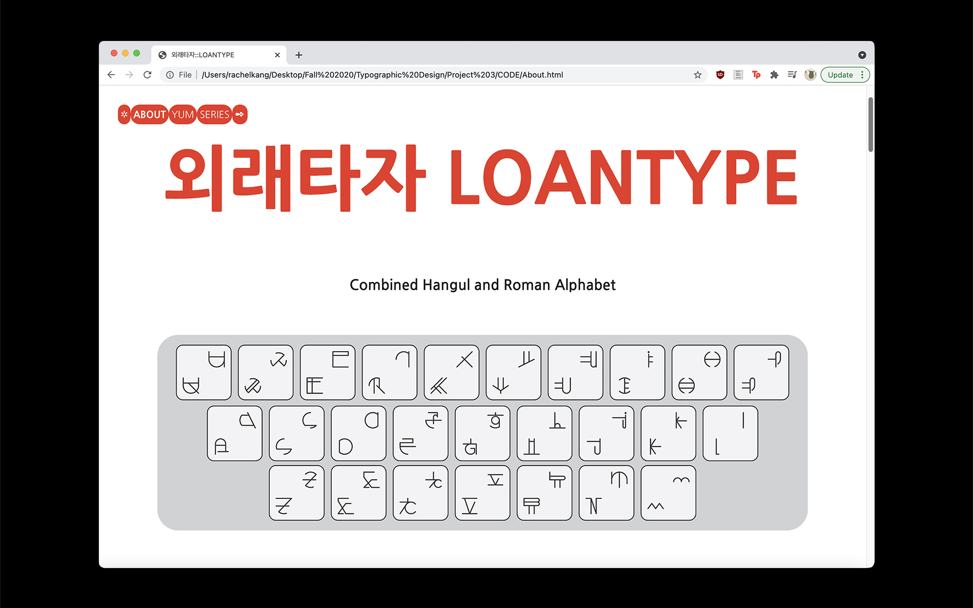
Inspired by Heesun Seo’s Roman Hangul, LOANTYPE is combined Hangul and Roman alphabets based on their placements on the computer keyboard. The name of the project, LOANTYPE, comes from the term loanword. A loanword is "a word adopted from a foreign language with little or no modification." The artist created the glyphs using the paradox of loanwords being part of our language while its origin is a foreign language. LOANTYPE is part of our writing system and part of a different writing system like a loanword.
서희선 디자이너의 Roman Hangul에서 영감을 얻은 외래타자는 컴퓨터 키보드의 위치에 따른 한글과 알파벳의 복합 형태이다. 프로젝트의 이름인 외래타자는 단어인 외래어에서 유래되었다. 외래어는 "외국에서 들어온 말로 국어에 널리 쓰이는 단어"를 뜻한다. 우리의 언어의 일부이기도 하지만 어원이 외국이라는 외래어의 모순을 사용하여 두 언어에 사용될 수 있는 글리프를 만들고자 했다. 외래타자는 외래어처럼 우리 표기 체계의 것이기도 하지만 다른 표기 체계의 것이기도 하다.